Unveiling MONUTOPIA: The ABCs of Awesomeness in Our Logo Design!
- Eman Hazza

- Jan 1, 2024
- 2 min read
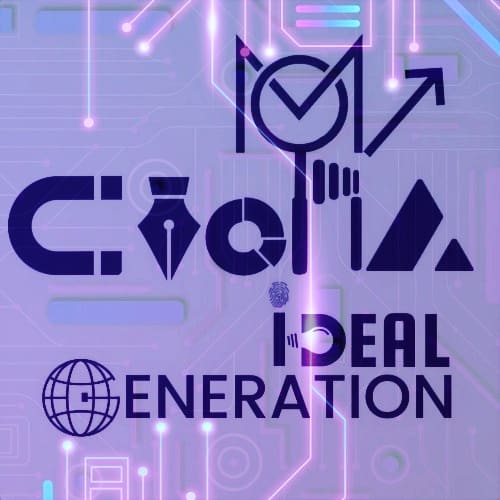
Greetings, logo admirers and deciphering enthusiasts! Today, we're pulling back the curtain on the enigma that is our logo—a masterpiece that's part geometry, part alphabet, and 100% a result of our relentless pursuit of our commitment, unraveling the extraordinary tale behind our logo—a fusion of letters and shapes that dance together in perfect harmony..
Picture this: our brilliant design team locked in a room with nothing but a mountain of alphabet blocks and a Rubik's Cube. After hours of playful banter and a suspicious number of pizza boxes, they emerged with our logo—a visual symphony of letters and shapes that said, "We're serious about what we do, but not about taking ourselves too seriously."
Now, for the untrained eye, it might just look like a collection of lines and curves. But oh, dear friend, it's so much more. Each letter and shape has been meticulously chosen, like ingredients in a secret sauce (but without the messy kitchen).
The circles? Clearly, a metaphor for the endless cycle of DIGITAL consumption fueling our creative minds. The triangles? Well, triangles are just cool. And as for the letters, let's just say they're the quirky characters in our design alphabet soup.
So, the next time you gaze upon our logo, know that it's not just a jumble of shapes and letters—it's a coded message of craft, a innovation-inducing puzzle waiting to be solved.
Crack the code, embrace the whimsy, and join us on this visual journey at MONUTOPIA!
Up for a quiz to exercise your creativity and let your imagination run wild! Can you guess what our logo represents? We challenge you to take a closer look and see if you can discover the hidden meaning behind it. We can't wait to hear your guesses and interpretations! Go to our Logo page to record your guess
